Studio Kumiho Website
Users come for the game, not the studio
Once upon a time
Overview
Studio Kumiho's website lacked engagement and users felt the site did not prioritize the games. We found most users visited the site on mobile and the company’s mobile version felt neglected.
One day
User Feedback
"I would like colors more in line with the style of the company"
Studio Kumiho Discord Member
"Looks like a programmer made it"
"probably some details about a game you're pushing would be good. It's just the trailer right now"
Johnson age 36
"the home page feels like it should be the "about the studio" page"
"Too much about the studio and not enough about the game. Feel like studios usually advertise their latest stuff on the homepage."
Hannah age 30
Pain Points


Lack of visual, too much text, no call to action.


Two menus
Unusable, unclear, not functional
Low visuals resulted in usability issue
The lack of visuals from a gaming studio left users unengaged.
Lack of game focus
Users felt there was too much focus on the studio info.
Most people viewed the site on mobile but mobile version was neglected
Insights showed majority of the users viewed our website through their phones but the mobile version was hard to navigate.

And because of that
Research
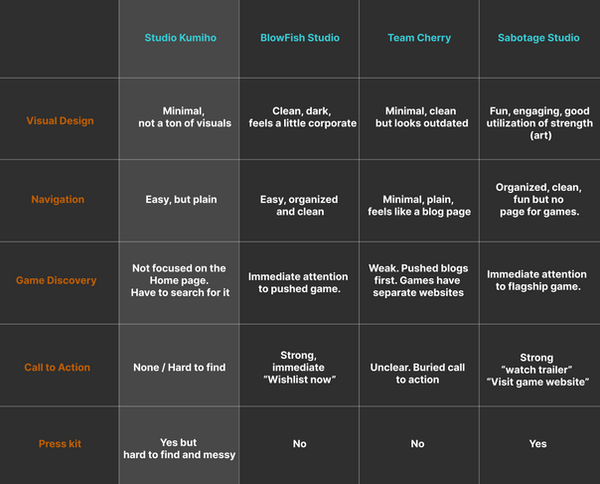
I studied other successful indie game company websites to do a competitive analysis.
Sabotage Studio
Nails visual storytelling as that is their biggest strength.
Team Cherry
While clean, lacked engagement and felt like a blog page with little call to action to their game.
Both studios had separate web pages for each
of their games.
Nailed visual storytelling, easy UX with clever focus on pushed game. However, their overall UI felt corporate.
BlowFish
Goal
Improve mobile experience and interface, put clear focus on product and clear navigation and call to action.
And because of that
Ideation and Execution

Showcase product front and center at home page with call to action
Visuals to support studio image
Announcement for new game
Studio story, just shortened


Maximize call to action buttons instead of
long list of texts.
Organized Press Kit
Indie studios thrive on word of mouth.
A well organized press kit helps journalists and influencers easily grab their preferred logos and game art.

Until Finally
Outcome
Main priority was to improve the layout for better user engagement and push the games (product) of the company. Given that most of our users check out the site on their phones, it was important to update the mobile experience as well.


User Feedback
"It’s so much better."
“It fills out the screen, showcases the game you want to showcase.”
“It's so much more engaging and focuses on the game and not too much on the studio. ”
bounce rates dropped, and click-through rates to our game pages increased.
61% increase in website traffic and 55% increase in unique visitors
Your story is important but people can't support what they cant find. Lead with what you are building,
then show why you built it.
Constraints
-
Due to the constraints of the Wix editing features for both web and mobile, I was unable to have free range with the visual design.
-
While I wasn't able to create a dedicated press kit page, I focused on what I could control: the internal asset management.
-
As a one man team and the main animator in the studio, I was given a short timeline to focus on revamping the site.
What I'd Improve
-
I would have liked to explore other web building sites to have less constraints editing the pages.
-
I would update and simplify the game pages.
-
I would have a press kit page for easier user experience for journalists and influencers who are interested in promoting the games.