Art of Cricket
Leading Cricket’s Transformation
Once upon a time
Overview
Cricket: Jae's Really Peculiar Game had a compelling story, music, and mechanics, but the visuals didn’t match.
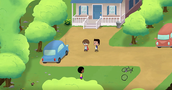
I led the transition from tile-based to fully hand-drawn background and animation, guiding the team to make the art the game’s standout feature.
One day
The Problem
Tile-based environments were better than pixels, but they failed to capture the game’s charm.
Company wanted organic shapes:
Boss wanted to move into organic tree shapes that were nearly impossible with tiles
Tiles wasted time:
I was not familiar with it. And my non artist colleagues also struggled with tiles.

And because of that
Research
I wanted to understand trending game art and what made them appealing.

What I found
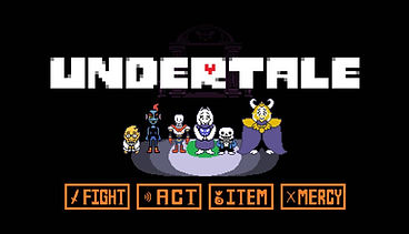
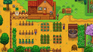
Old school game art had been trending for a while
but Cuphead and Indivisible made headlines for being different.


And because of that
Ideation and Executing
Start simple
I started with providing draw over roughs just to test how the art would look in game.
Build up details
Once programmers gave the green light I started adding texture to the environment.
Constraint
I wanted to make sure the painterly texture was not being lost due to compression.


And because of that
Results
This art style change gained a lot of traction for the game.
The art became the biggest selling point for Cricket.
Interest from publisher
-
11 Bit Studio and Fellow Travelers showed interest
- Nintendo sent a Dev Kit for Cricket to release on Switch
But one day
Iteration: Back to the drawing board
A new artist’s fresh eyes pointed out scale issues and over-ambition. She proposed we simplify the game but I feared we would lose what made Cricket unique.
I took that feedback, re-framed the goals, and led a second iteration.
The Feedback and Proposal
-
Scale inconsistencies
-
Ambitious interiors
-
Bare environment
-
Simplify the game to save time, money, and keep within the scope of the team size.


Studio concern
Simplifying the game will take away from what customers love about Cricket.
Goal
Come up with a solution that saves time and money, while maintaining what customers loved about Cricket
And because of that
Ideation and Execution

Scale down and flesh out
I collaborated with the level designer to scale down the map size but flesh it out with buildings.
New unique reusable building assets
Created easy to recolor, unique sets of reusable buildings for programmers to mix and match to fill out space while saving artists time.
Prioritize the details
With the saved time, the artists are able to prioritize more unique assets, interiors and details that make the game stand out.


Timeline Estimate: 2-3 months
Small set back but will save us time long term.
What this fixed
Save time
Reusable assets and scaling down the map saved artists time.
Use saved time on interiors
This allowed us to keep the cartoon interior style
Maintain painterly detail
Keep the details and style that customers loved about Cricket.
Overall
Simplified and scaled down the game without losing what made the game unique.


Until Finally
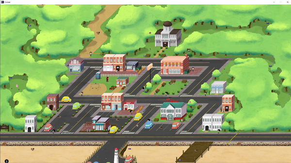
Outcome
-
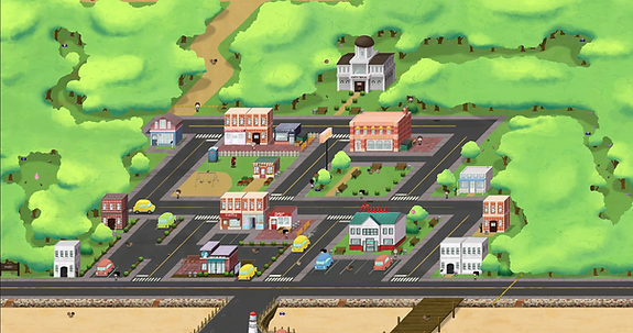
The map was scaled down 25% and the town was densely packed with buildings.
-
The scaling was consistent, characters did not feel out of place, and they looked like part of the world.
-
Interiors that once felt too big now felt like the characters belonged.


Always consider the end user's needs.
Metrics
-
57% increase in steam wishlists from the first design change
-
Officially signed with a publisher which resulted in an extra 51% increase in steam wishlist
-
Created structure when we hired more artists
Constraints
-
Being the only artist = having limits
-
Lack of knowledge in environment art
-
Still had a long way to go in game dev during this time
What I'd Improve
knowing what I know now...
-
More explorable buildings
-
More variety in NPCs and enemies
-
Lighting change, day to night
-
More interactable items
-
Hire more artists sooner